Back to workHunchha Digital Agency -
Product Design Case Study / Portfolio concept
Hunchha Digital Agency -
Agency Website
shaped into a story.
A digital agency landing design with branding, service messaging, and modern web layout.
Project Overview
The work starts before the polished shot.
I treated Hunchha Digital Agency as a product problem first. The Dribbble image is the final visual layer, but the useful story sits underneath it: who the screen is for, where a user might pause, and what needs to be checked before the interface can feel ready.
Problem Discovery
The real risk was hesitation.
The agency page needed to present credibility, services, and style in one clear path. I focused on the moment before the click: does the page explain itself quickly, does the next step feel natural, and does the visual hierarchy support that decision?
Visual hierarchy, interaction path, conversion clarity
Journey notes, content priorities, and expected user behavior.
Interface choices tied back to user hesitation and action clarity.
A good-looking screen is only useful when the user knows what to do next.
User Journey
I started by asking what someone needs to understand in the first few seconds of Hunchha Digital Agency.
Content Logic
The content was grouped around the natural decision path instead of being treated as decoration.
Decision Risk
I marked the moments where trust, scanning, or a clear call to action would decide whether the screen worked.
Design Process
From first intent to a clearer product flow.
I moved from intent to structure before pushing the visual style too hard. That kept the work grounded: every section needed a job, every action needed a reason, and every polished screen needed a quality check behind it.
Discover
Map
Frame
Prototype
QA
Refine
Problem and user intent
I started by asking what someone needs to understand in the first few seconds of Hunchha Digital Agency.
Journey and content hierarchy
The content was grouped around the natural decision path instead of being treated as decoration.
Defined a bold agency hero
This became the first priority because the screen had to make its purpose clear before asking the user to do anything.
Interaction clarity
Checked whether the primary action is still obvious after the visual styling is added.
Handoff and next steps
Turn the concept into a clickable prototype.
Dribbble Screen Gallery
All project visuals now live inside the case study.
The real images from the Dribbble detail page are pulled into this case study, so the reader can review the actual UI screens without leaving the portfolio. No repeated crop placeholders here.
Primary Dribbble screen
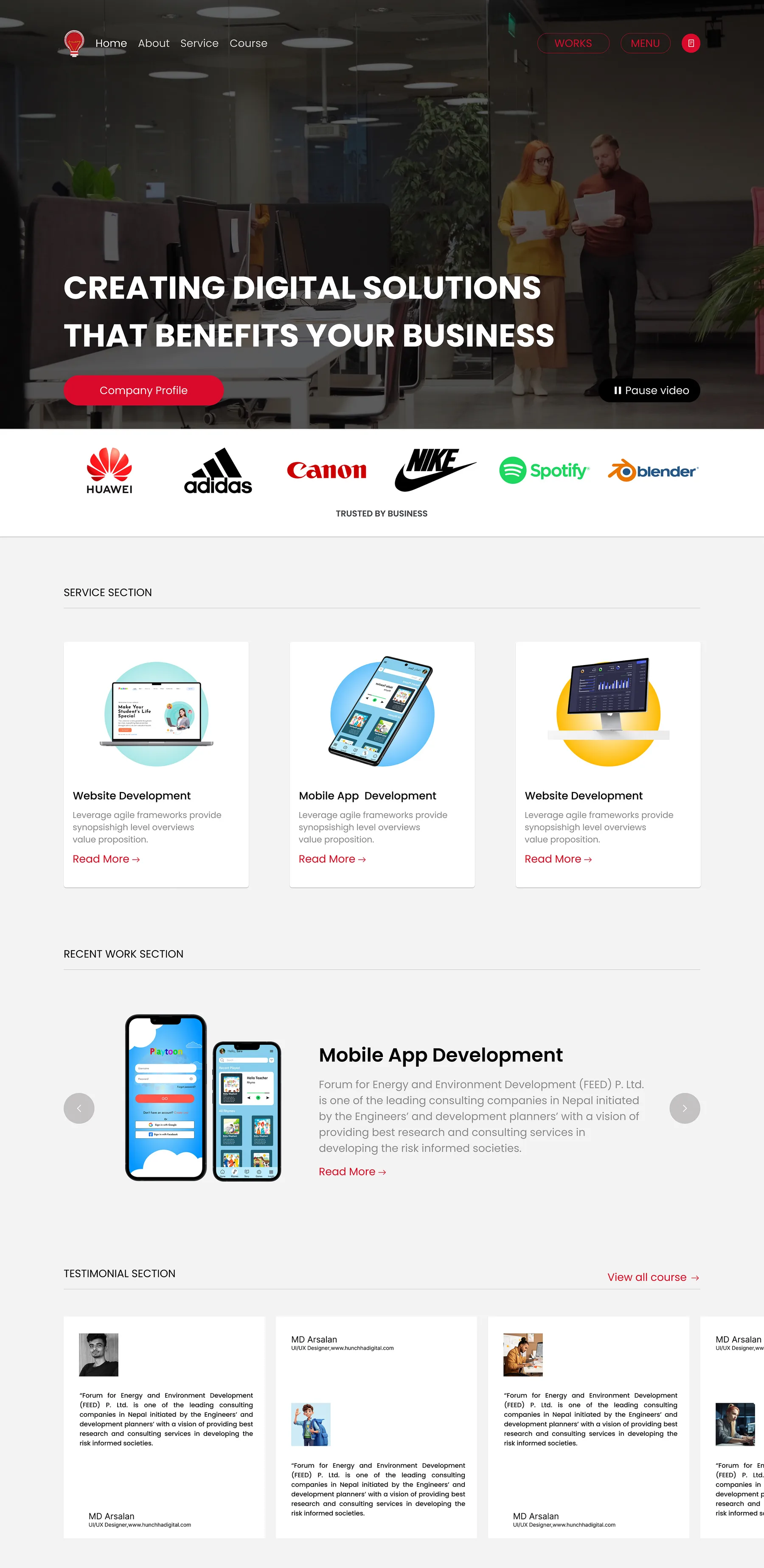
This is the main presentation image from the project detail page.
UX Decisions
Why the screens were shaped this way.
Defined a bold agency hero
This became the first priority because the screen had to make its purpose clear before asking the user to do anything.
Organized service messaging
I used this direction to organize the interface into smaller decisions, so the layout could be scanned without effort.
Created a modern landing structure
This gave the concept a repeatable rhythm, making the page feel like part of a usable product rather than a one-off visual.
QA Lens
I looked for the places the flow could break.
Interaction clarity
Checked whether the primary action is still obvious after the visual styling is added.
Responsive scan path
Reviewed the order of content on smaller screens so the story does not collapse into a long poster.
Handoff notes
Captured the assumptions that would need real content, edge states, or developer notes before build.
Outcome
What the concept proves, and what it still needs.
A digital agency landing design with branding, service messaging, and modern web layout.
This is still a portfolio case study, so I am careful not to fake product metrics. The value is in the clearer flow, the visible UI system, and the checks that would guide the next iteration.
Stronger brand presence
Clearer service discovery
More polished web direction
Visual Source
Want to review the original shot?
This page documents the UX and QA thinking. The original visual presentation is still available as supporting work evidence.